Pacific Harvest is a company that sells edible seaweed and seaweed products. An established business that sell their products though health stores, whole food supermarkets and online.
The business was purchased by new owners that saw the opportunity to increase sales. Especially through their exisiting WooCommerce powered online store.
They contacted eg. Web Design to help them upgrade the website with increasing conversions in mind.
Conversion based website review
I conducted a comprehensive review of the current site. To determine what on the site was working well and what to improve.
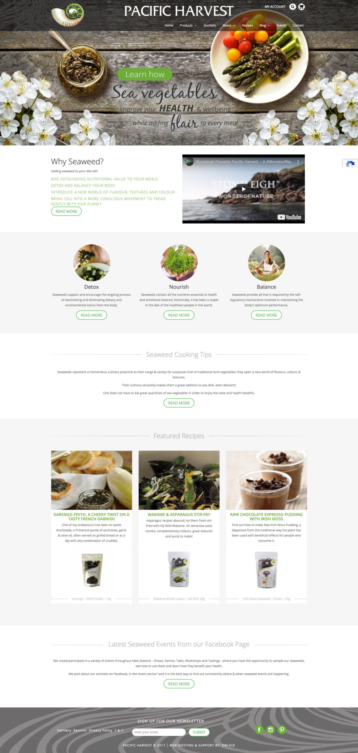
The old site had good content. However there were a few usability problems. The site didn’t use persuasion techniques and had many distracting elements that didn’t add to the user experience.
The checkout process was an area where definite improvements could be made.
The conversion rate hovered around the 2% mark. While not bad, there was plenty of room for improvement.
The home page
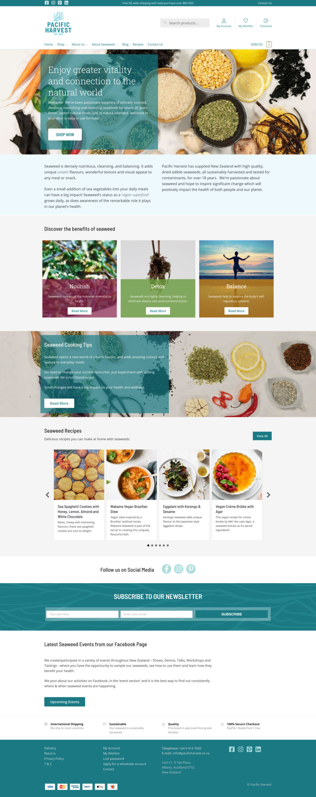
Pacific Harvest decided to rebrand with a new logo and branding. So I incorporated the new design into the redesign. The home page also benefited from new photography of seaweed dishes.
The home page had information about the benefits of seaweed. But didn’t encourage users to take the next step to browse or purchase products.
Of particular concern was a header image that had what looked like clickable buttons but were not. Using HotJar click tracking I saw that many users were clicking expecting to go to another page. This was probably annoying and/or confusing to people.
A bigger search box resulted in more people searching for products and finding them easily. Users that search convert at a higher rate than those that don’t.
Comparing three month periods before and after the relaunch website searches increased almost 193%. Users that searched and went on to buy increased by 445%.
Product listing / Category page
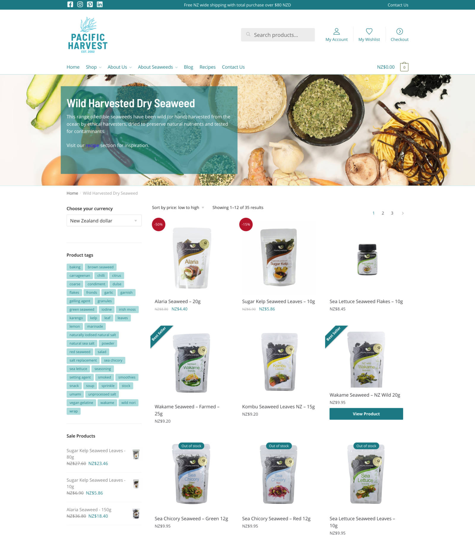
The category page was redesigned to include ‘Best Seller’ and sales labels on the products. Better quality product image were used.
The new site had a mega menu style dropdown to show the full range of seaweed types. The sidebar was then used to display searchable tags. Tags give the user the ability to search based on seaweed type, eg dried or granules and the use for the seaweed, eg baking or salads.
Product pages
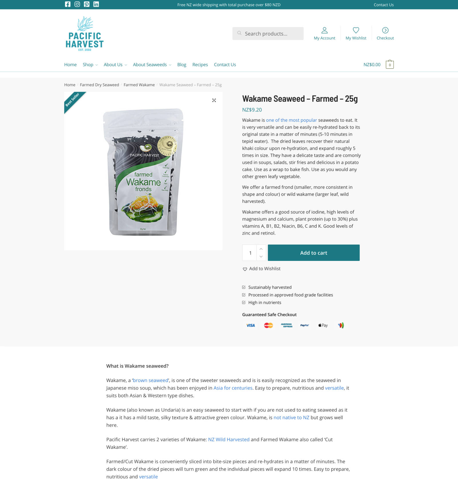
Product pages are to inform users about the product and encourage them to add it to the cart.
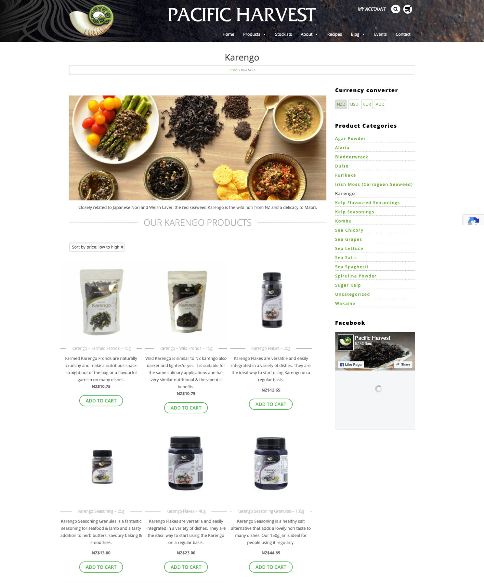
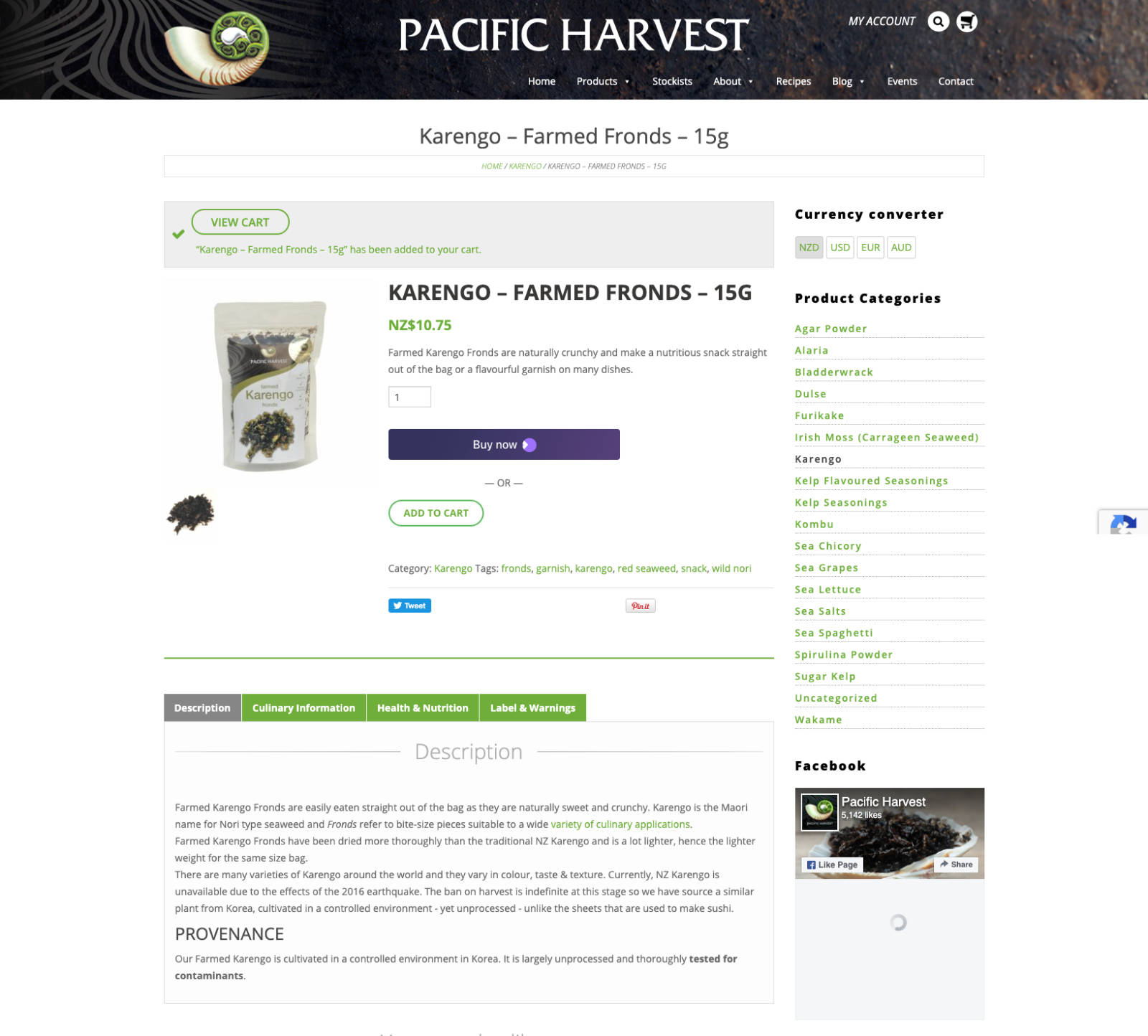
The old site’s product page had many distractions. Social share buttons that people rarely used. A sidebar with product categories and a YouTube video. These were removed.
The ‘Add to cart’ button made larger. Additional bullet points about the product and 100% secure checkout were placed under the ‘Add to cart’ button.
This resulted in a 70% increase of users adding products to their cart
Cart page
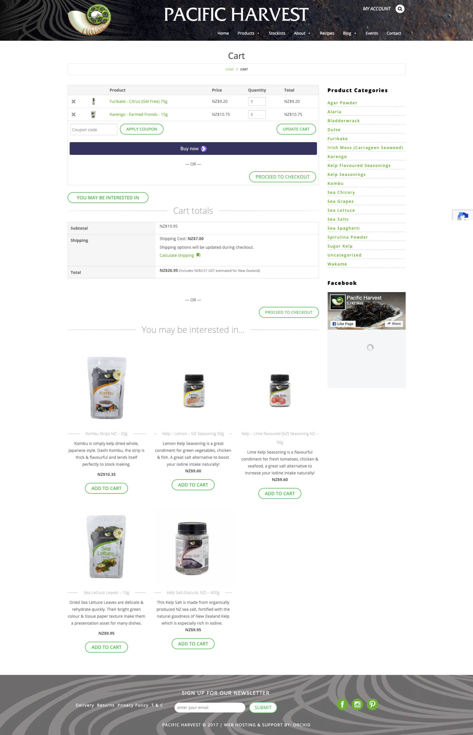
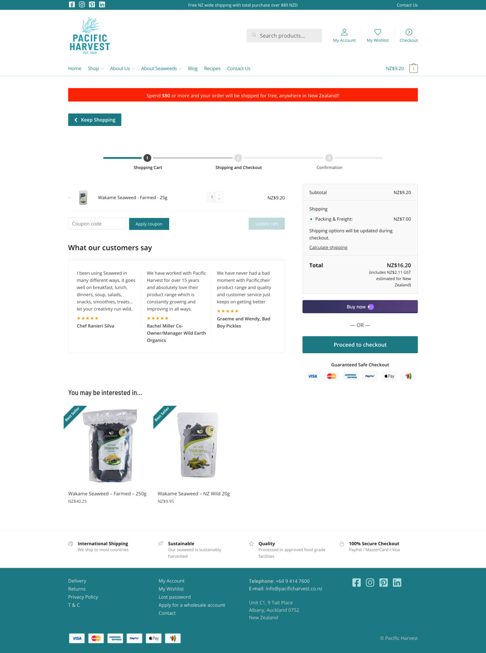
The cart page was simplified, getting ride of the sidebar and other distractions.
Testimonials from other customers were place under the cart. Providing social proof that other had purchased and enjoyed the products.
A checkout process indicator was added to the top of the page. Informing users where they are in the checkout process.
The cart page is a good page to encourage users to purchase additional products. Pacific Harvest uses a free shipping threshold to encourage users to order more than $80 of goods to qualify for free shipping.
A red banner informs customers they get free shipping if they order $80 worth or more. This helps increase the average order value (AOV).
Checkout page
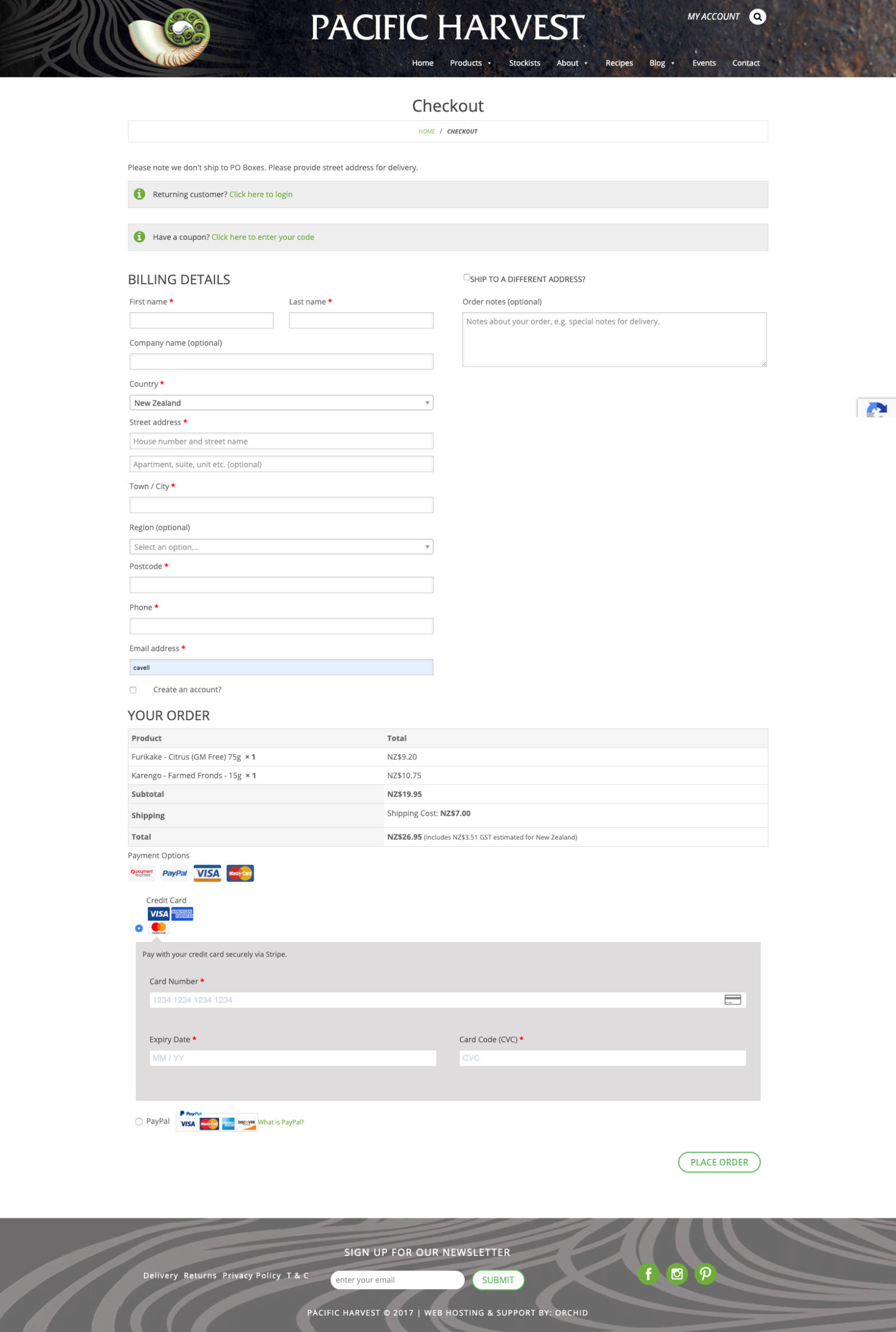
The standard WooCommerce checkout page design isn’t the best for usability and conversions. The old site used the standard layout with a barely visible ‘Place order’ button way down the bottom of the page.
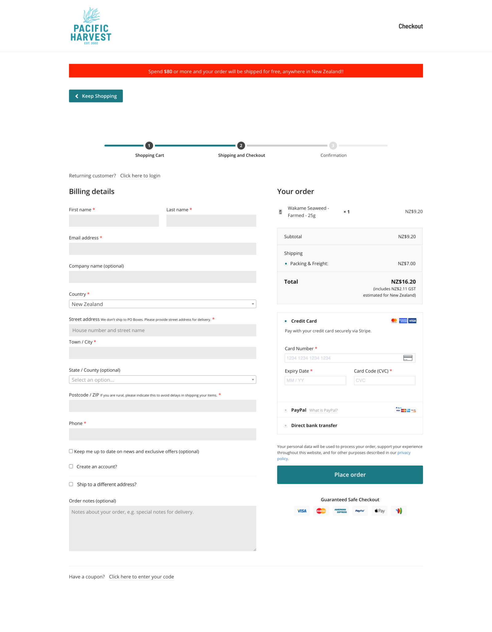
The checkout was changed to a two column layout. The input fields are on the left and the product information, credit card form and ‘Place order’ button are on the right.
The checkout page has the progress indicator at the top. It also removes the distraction of the navigation and has a much simpler design.
This resulted in a 103% increase in users completing their transaction.
Results
The combined improvements resulted in a conversion rate that improved from 2.74% to 3.80%.
Average order value rose 29%.
Orders increased by 64%
(Dec 14 2019 - Feb 14 2020 compared to May 14 2020 - July 14 2020)
Takeaways from this project...
Pacific Harvest now have a WooCommerce store that is designed to convert users into paying customers.
With additional marketing through email and paid traffic they can further increase sales.
They can invest in marketing knowing that they are making the most of the traffic to their site. Their advertising spend isn’t going to waste on a low converting online store.
LET'S GET STARTED
If you have a WooCommerce store that could use some love, use the form below to get in touch and I'll email you back to find out more about your needs.
